The Constraint
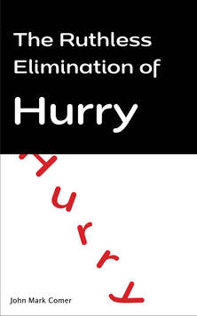
The book cover needed to be able to be understood at a glance while standing out among other books surrounding it.

One Key Design Decision
In the past this book cover has used blue and red as the primary background color, I decided to use a bright yellow because it represented caution and warning which paired with the spikes surrounding the title to give a feeling of anxiety and being trapped. All this is shown through the visuals before you even read the title.

Final

Why It Works
This design works because it solves the problem of blending in and people passing by it on the book shelf because the meaning isn’t clear and easily understood by people passing by it.


The Ruthless Elimination of Hurry
The goal
Design a book cover that stands out on a bookstore shelf while visually communicating the book’s core message about slowing down, intentional living, and eliminating unnecessary hurry.
Role: Graphic Designer
Tools: InDesign


